Eye-tracking has quickly become one of the most powerful tools across a variety of research applications. This tool provides us with a window into user attention, showing researchers where people look first, how they move their eyes across a screen, and what they miss. With that said, effectively leveraging these insights requires interpreting multiple forms of output. Eye-tracking data comes in several formats, each offering its own unique perspective. In this article, we’ll be walking through the three most common outputs – heatmaps, gazeplots, and opacity maps.
Heatmaps: The Big Picture of Attention
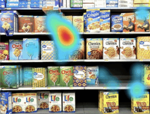 Heatmaps combine the gaze data of multiple users into one easy-to-read visualization. Warm colors like red and yellow highlight where most people looked, while cooler blues and greens highlight the areas that received little or no attention.
When they’re useful:
- – Checking if your CTAs or key visuals are actually getting noticed
- – Evaluating your page’s visual hierarchy – what stands out vs. what fades into the background
- – Comparing multiple design variations at a glance
Heatmaps excel at delivering an instant overview of your design’s most and least impactful elements. They make it easy to provide stakeholders with a high-level overview of where attention is going (or not going) without diving into detailed statistics.
Gazeplots: The Step-by-Step Journey

Gazeplots, also known as scanpaths, demonstrate the sequence of eye movements. Each fixation is marked with a dot (usually numbered) and connected by lines, so you can follow the exact path a respondent’s eyes took as they explored your product, ad, or page.
When they’re useful:
- – Understanding reading or scanning patterns – great for content-heavy layouts
- – Spotting visual distractions or elements that pull focus away from the goal
- – Testing whether users are navigating and digesting content in the intended order
Gazeplots add additional context to the high-level overviews that heatmaps provide. They clearly articulate the order of attention that your designs command, allowing you to course-correct if respondents are skipping your headline and jumping straight to an image.
Opacity Maps: Seeing Through Their Eyes

Opacity maps portray a user’s perspective by omitting everything they didn’t look at from the tested image. Only the spots that they fixated on during an eye-tracking test are visible, creating a spotlight-like output.
When they’re useful:
- – Showing exactly what was in focus vs. what was ignored
- – Explaining “blind spots” in designs to stakeholders visually
- – Demonstrating attention differences between beginners and experienced users
Opacity maps are also incredibly powerful in presentations because they help everyone “see” the screen the way the user saw it. The result is crystal clarity on the design elements that drew attention and those that were ignored.
Which One Should You Use?
| Output Type | Best For | Why It’s Useful | Answers the Question: |
| Heatmaps | Overall attention trends | Clear, aggregated visual patterns | “Where do people look most?” |
| Gazeplots | Understanding attention flow | Reveals sequence and navigation order | “What’s the viewing path?” |
| Opacity Maps | Explaining user perspective | Immersive, shows what users truly notice | “What does the user actually see?” |
While there are distinct advantages to each eye-tracking output, no single measurement can conclusively validate or invalidate a design on its own. They each answer different questions. At RIWI, we integrate these outputs into our broader non-conscious measurement toolkit, pairing them with implicit association testing and traditional research methods. The result? Evidence-backed insights that bridge the gap between what people say caught their eye in a design and actually did.